
Table of Contents
A strong CIAM strategy depends on visibility. Teams need to understand who is logging in, where friction appears, how authentication flows perform, and how users and B2B tenants engage. Descope’s Project Dashboards bring this visibility together in one place. Teams can leverage four powerful and insightful dashboards: User Activity, Tenant Activity, Operations & Security and Flow Analytics.
Together, these dashboards serve as the central hub for understanding user behavior, authentication performance, and tenant health, giving teams the clarity they need to continuously improve their identity experience.
Why visibility matters
Even with modern CIAM solutions, teams often face the same challenges:
User data is scattered across logs, BI platforms, and monitoring tools
Authentication flows can feel like black boxes, making it difficult to pinpoint where users drop off
Multi-tenant identity models require constant engineering effort just to track onboarding and usage
Teams lack a unified place to understand how their identity system is performing moment to moment
Without a single source of truth, teams end up reacting instead of improving. Onboarding slows, troubleshooting becomes guesswork, and meaningful insights go unnoticed.
Descope’s Project Dashboards solve this by surfacing key identity signals directly inside the Console, in a clear and accessible format.
User Activity
The User Activity dashboard provides a high-level view of how users are signing in to your application. It highlights patterns in new and returning user behavior, shows where traffic originates across countries, devices, and operating systems, and reveals which authentication methods users choose most.
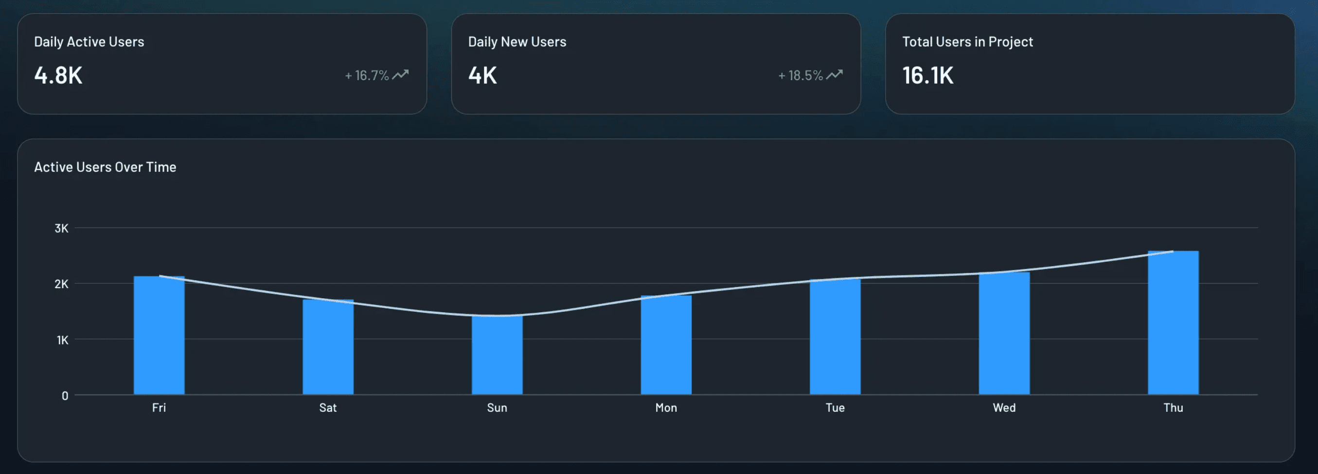
By centralizing this data, teams can understand user engagement, identify friction, and compare the performance of methods like passkeys, passwords, magic links, and social login, all without relying on external analytics tools.
Let’s say a travel booking company wants to understand how travelers authenticate across devices. They notice that social login leads to high conversion during checkout, while password-based login causes unexpected drop-offs on mobile. With the User Activity dashboard, they can monitor new and returning travelers, evaluate the performance of each login method, and detect early friction signals that may impact booking completion.
Tenant Activity
For multi-tenant and B2B applications, the Tenant Activity dashboard provides real-time insight into how each tenant is engaging with your platform. It highlights numbers of active tenants, newly onboarded tenants, SSO-enabled tenants, and specific tenants with low or declining activity.
These signals give customer success, support, and product teams the information they need to understand tenant health and intervene proactively.
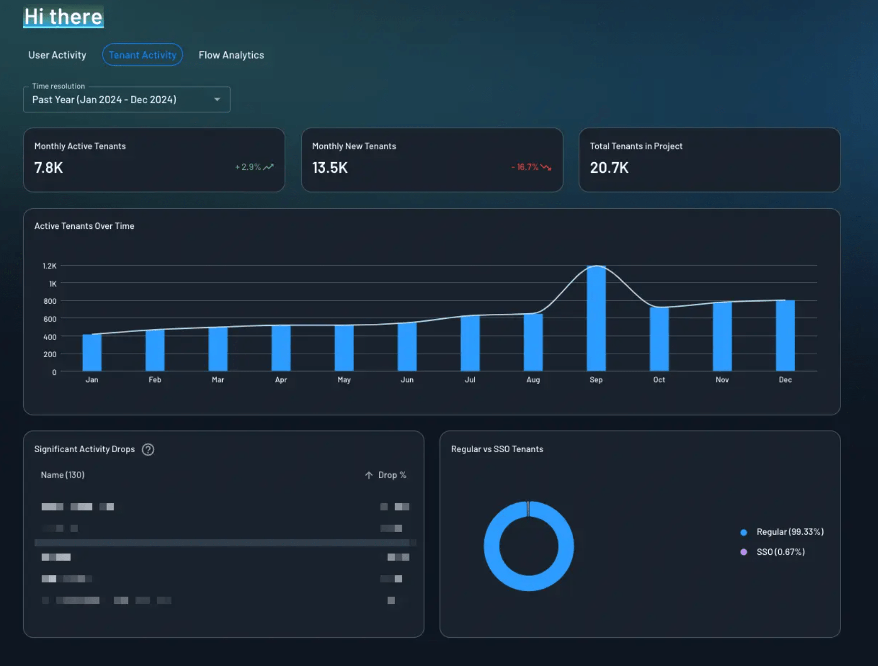
Suppose there is a property management platform that supports many apartment complexes, each operating as its own tenant with unique login preferences. Customer success teams need to know which tenants are active, which have enabled SSO, and which show signs of adoption decline. The Tenant Activity Dashboard surfaces these trends instantly, enabling teams to proactively engage high-value tenants, strengthen onboarding, and reduce churn risk.
Operations & Security
The Operations and Security dashboard gives teams a clear view of where authentication activity is coming from and whether anything unusual is happening. This dashboard highlights the top IP addresses generating authentication requests, which can help teams spot unusual traffic spikes or potential security threats.
It also shows the countries with the highest request volume, offering geographic insight into user activity or unexpected regional surges. Referrer data helps teams understand which sites, pages, or applications are directing users to their authentication flows, while email domain distribution can reveal organizational adoption patterns or anomalies during signup and login.
Additionally, country codes for user phone numbers help teams verify where SMS or WhatsApp-based authentication is being initiated, which can surface misuse or signaling issues.
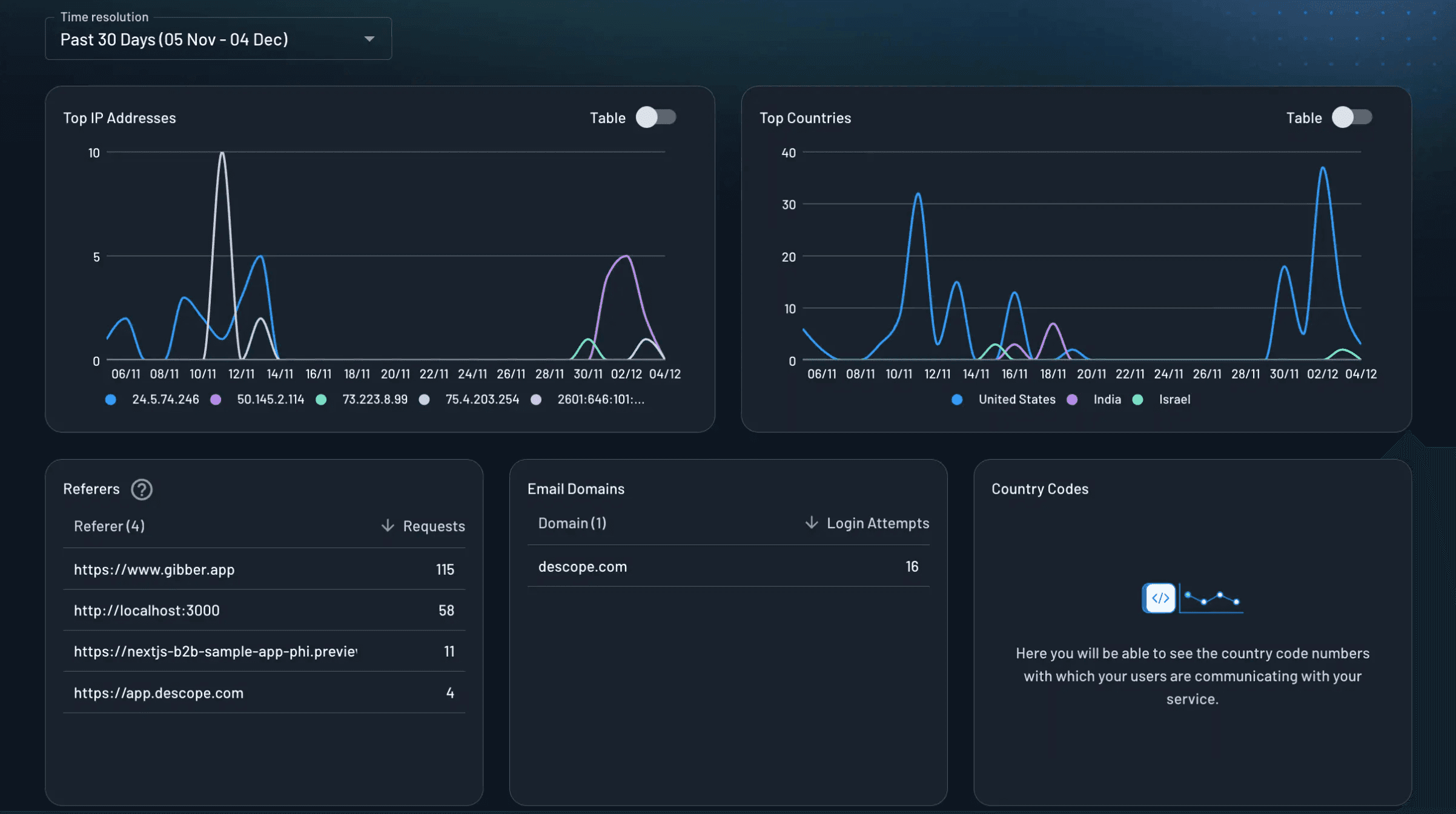
Imagine an online education platform that suddenly notices an unusually high number of authentication attempts from a single IP range and unfamiliar email domains. At the same time, traffic begins appearing from countries where the platform does not operate. With the Operations and Security dashboard, the team can immediately see the source of the activity, confirm whether the behavior is legitimate or suspicious, and take action before it impacts users or overwhelms login infrastructure.
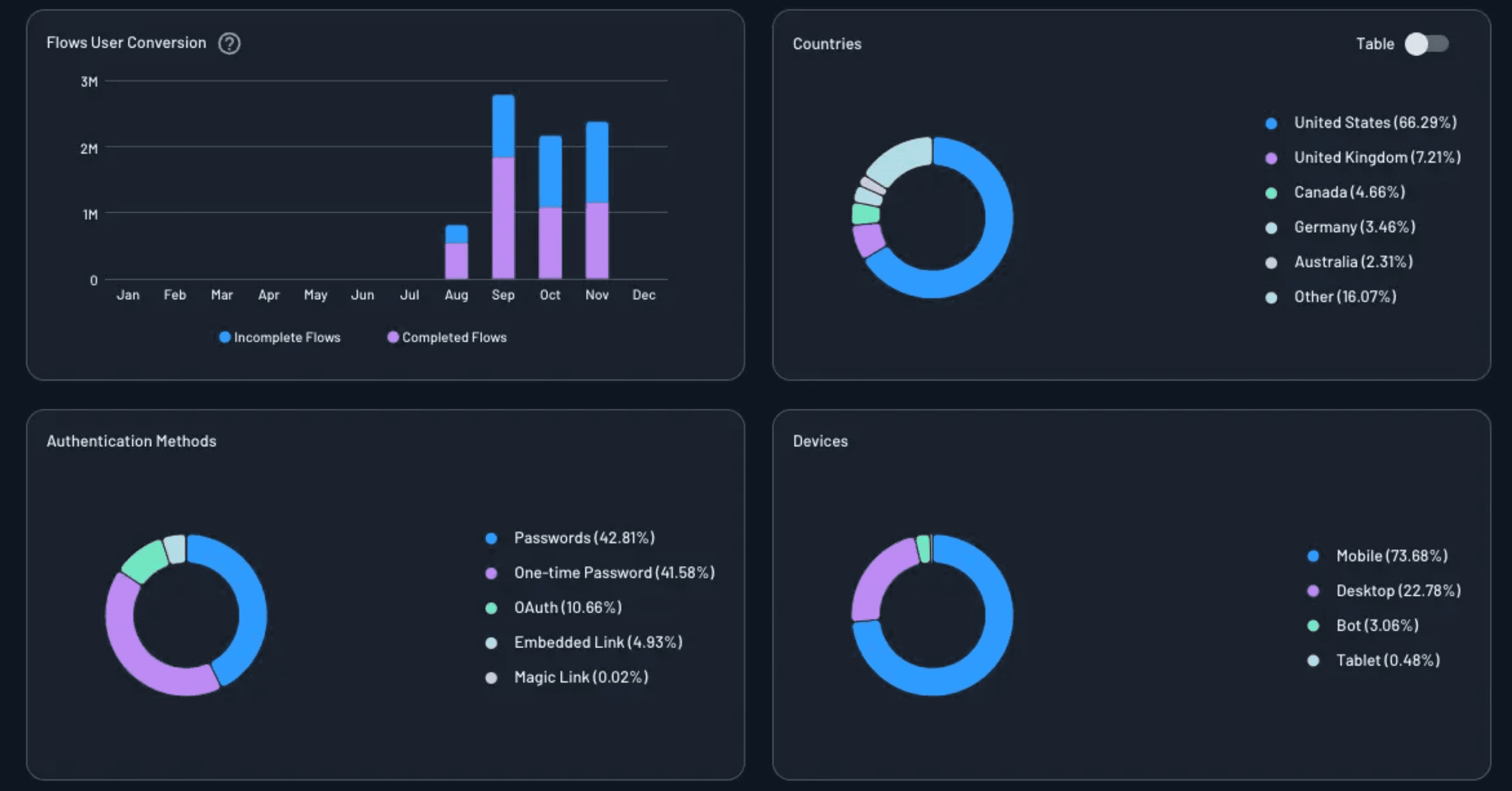
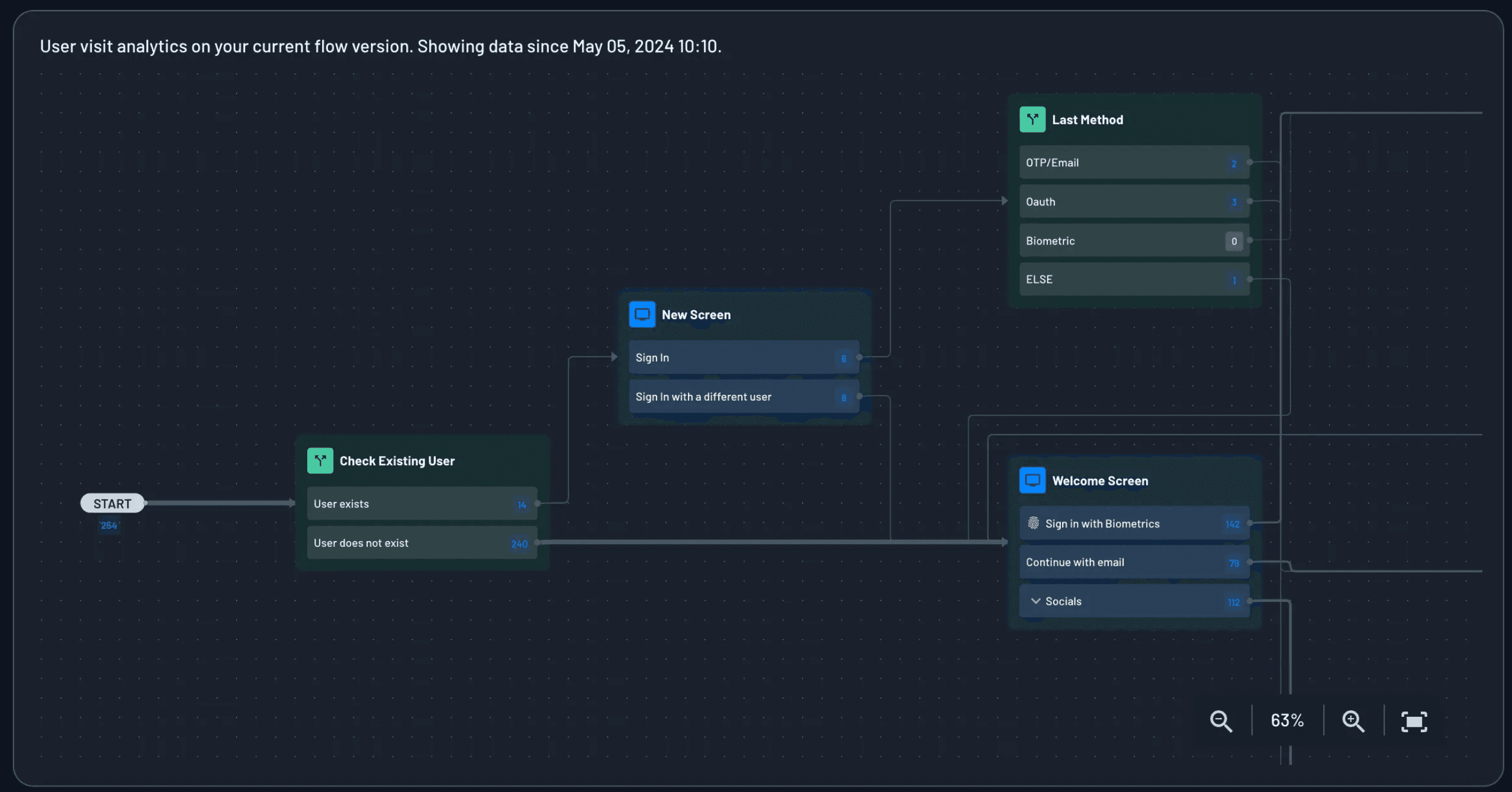
Flow Analytics
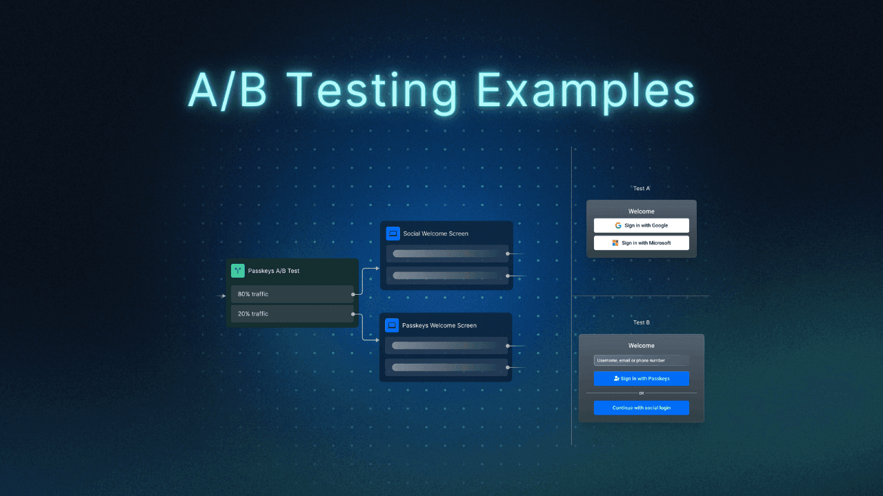
The Flow Analytics dashboard offers step-by-step visibility into the authentication journey. It shows how many users enter each stage of a Descope Flow, how many continue, and where they exit. This makes it easy to identify friction points, whether users are confused by MFA enrollment, stuck at the OTP screen, or dropping off during identity verification. It’s also a helpful place to analyze results of any A/B testing experiments organizations run with their user journeys.
By understanding these detailed flow dynamics, teams can confidently refine authentication journeys and improve overall conversion.
Also Read: 4 Ways to Improve Conversion With User Journey A/B Testing
Take the example of a fitness app that introduces MFA to boost account security but immediately sees a decline in successful sign-ins. The team doesn’t know whether the problem stems from OTP failures, MFA misunderstanding, or device-specific issues. The Flow Analytics Dashboard pinpoints exactly where users drop off.
With this clarity, the team can streamline screens, reorder MFA methods, or simplify enrollment to improve both security and conversion.
Descope Project Dashboards provide a strong foundation for understanding authentication trends within the Descope console. For teams that rely on external monitoring platforms, Descope makes it simple to extend this visibility into the tools they already use.
Extend visibility with audit streaming connectors
Many organizations already rely on observability tools such as Amazon S3, Datadog, New Relic, or Sumo Logic to monitor application and authentication health. Descope supports these workflows by making it easy for developers to stream audit and troubleshooting events into the systems their teams already use.
Audit streaming services help centralize identity logs, monitor sign-in activity, detect anomalies, support incident response, and meet compliance requirements. Instead of building custom ingestion pipelines, developers can configure streaming from Descope in just a few steps.
Through the Descope Console, they select their preferred connector, provide the endpoint or credentials, choose which audit events to send, and test the configuration. Descope then forwards the data automatically as users go through authentication flows.
S3, Datadog, New Relic, and Sumo Logic are only a few of the available connectors. Descope offers a growing library of audit and analytics integrations that allow teams to plug identity insights into their preferred monitoring stack.
Conclusion
Descope Project Dashboards give teams real-time visibility into how users authenticate, how flows perform, and how tenants engage. By consolidating essential CIAM insights into a single, easy-to-understand view, the dashboards empower teams to diagnose issues, optimize authentication journeys, and support customers more effectively.
With Descope, you can monitor, iterate, and enhance your entire identity experience, without relying on engineering for custom reports or external analytics tools.
If you are ready to try it yourself, sign up for a Free Forever account or book a demo with our team today!