

Table of Contents
Signing up and logging in are often a user’s first interaction with your brand. Well-designed authentication flows validate credentials while establishing trust and setting the tone for the entire user experience. Ultimately, effective login UI design can mean the difference between converting a new customer and losing them to friction.
This guide aims to equip you with insights and best practices for seamless, user-friendly login page design. You’ll learn how to increase successful signup and login rates, decrease drop-offs, and boost conversions just by following a few simple design principles.
Let’s start by exploring some basic but indispensable building blocks for better login UI design.
Understanding authentication design principles
Humans have innate preferences about how things should look and work, which is why the fundamentals of good design apply just as much to login screens as they do to other disciplines. The use of space, color, and thoughtful placement can create both great art and accessible login interfaces.
This is the key design question in login page design: “Is this clear at face value? If I were a first-time user, would I be confused or confident?” Ultimately, if something feels off about your authentication UI, you’re probably right.
Good authentication design balances simplicity with security. Clean layouts with minimal input fields help users complete authentication quickly and easily. Visual hierarchy guides them naturally through each step, while consistent styling builds trust and reinforces your brand. Smart, contextual feedback shows users exactly where they are in the process and what they need to do next.
Let’s take a closer look at the core themes of great login UI design, including login page examples for reference.
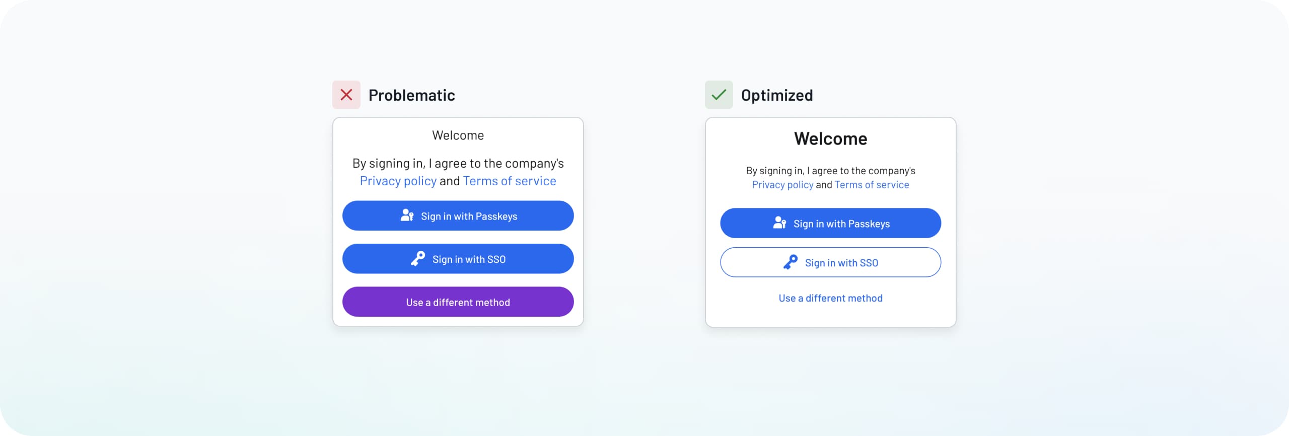
Keep the layout simple
Simple layouts reduce friction—meaning they don’t disrupt the natural flow—and help users complete signup or login quickly. What does a simple layout entail? Clear containers for information, minimal input fields, and straightforward instructions. When screens are cluttered with too many choices, users enter “analysis paralysis” and become more likely to abandon login.
Looking at the examples below, you can see how cluttered layouts with scattered social buttons and redundant text create unnecessary barriers and confusion.
Common mistakes include:
Lengthy, bloated text instructions at the top of the login interface
A long list of social providers (Google, Apple, Facebook, Slack, Microsoft) that overwhelms users with choices
An unnecessarily all-caps “OR USE A DIFFERENT METHOD” divider
A “Sign in” button inconsistent in size versus the other elements

The optimized version shows how thoughtful organization makes a difference:
Two popular social login methods (Google and Apple, with the most commonly used on top), though up to three options is acceptable
A clear visual break between social and email options
Simple, focused input fields
Descope Tip: Create streamlined layouts using Descope Styles. You can customize the placement of each component for a simpler, more accessible look.
Use clear visual hierarchy
Good visual hierarchy guides users naturally and logically through the flow, reducing hesitation and abandonment. When all the elements are tough to distinguish from each other, it makes finding the right action or path much more difficult, meaning more drop-offs and frustration.
Look at the login screen examples below, and we can see how proper button styling and layout placement make a difference.
The problematic version shows:
Same-sized, similar-colored buttons for every action
No clear distinction between primary and secondary choices
Poor use of space and alignment
The optimized version demonstrates better hierarchy:
Primary “sign in” button is prominent and distinctly colored
Secondary actions use less prominent styling
Clear spacing between different action types
Logical placement of buttons where users expect them
Descope Tip: Use the style designer to make buttons distinct for primary and secondary actions. You can adjust colors, sizes, and spacing while previewing how everything works together.
Think beyond a single screen
Planning for multiple scenarios means considering every step in the authentication journey. That includes errors, successful verification, confirmation screens, and everything in between. If your login flow calls for multiple states, screens, and transitions, prioritize making these segues subtle and familiar (rather than jarring and confusing).
Looking at the login screen examples below, we can see the vast difference between narrow and comprehensive approaches.
The problematic example shows:
Generic error messages with no clear connection to the issue
No guidance on how to fix the problem
Sudden page changes that can disorient users
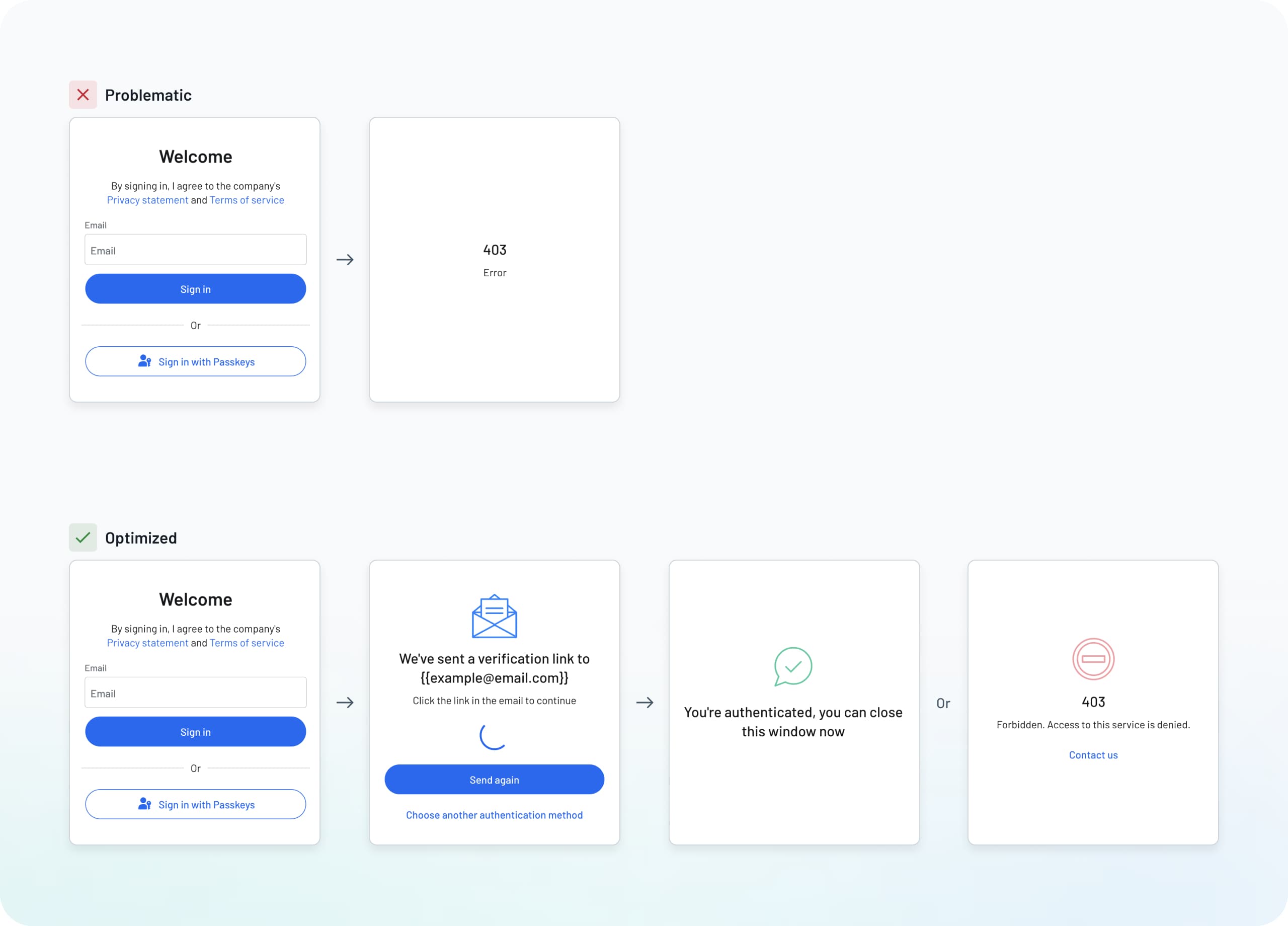
The optimized examples offer better visibility and account for more scenarios:
Specific errors and error codes connected to affected fields
Clear suggestions for fixing issues (e.g., not a valid email address)
Smooth transitions between states with loading animations
Obvious navigation options for users who need to go back or retry
Descope Tip: We’ve thought through all the common authentication scenarios and mapped them into logical flows. You can use these plug-and-play templates as a starting point, knowing they cover the full range of use cases.
Maintain consistency
Brand consistency in authentication flows is about more than just looking good. While there’s nothing wrong with wanting to keep your themes, colors, and logos front and center, consistency builds trust and reinforces your identity at every step. When users see familiar elements throughout their journey, they feel more confident about sharing their information.
Looking at the examples, we can see how inconsistent design elements can undermine user trust.
The problematic version shows:
Mismatching colors between screens
Inconsistent button styles throughout the flow
Different fonts and text sizes
No cohesive visual language
The optimized version maintains a unified experience:
Consistent colors aligned with brand themes
Uniform button styling across all screens
Matching typography and spacing
Clear visual identity from start to finish
Descope Tip: Maintain consistency by applying your brand elements (colors, fonts, buttons styles) automatically across your entire authentication flow. Even if your brand goes through updates, Styles makes it simple to apply those changes to all your user-facing screens.
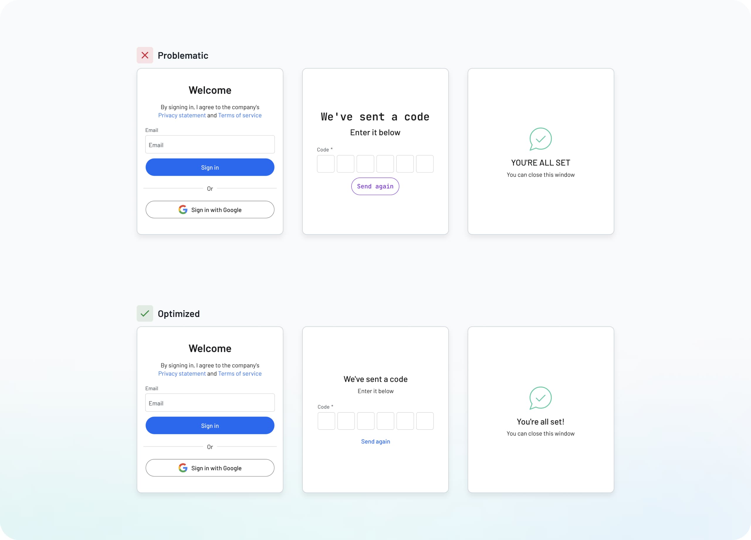
Use visual feedback wisely
Clear visual feedback helps users understand where they are in the authentication process and what they need to do next. Think of this as a subtle set of road signs that nudge the user in the right direction without disrupting the natural flow. This reduces confusion and uncertainty while building confidence in your platform.
Most importantly, if a user reaches out to support, it equips them with more information to help resolve the issue. Looking at the login screen examples, we can see how different feedback styles affect the user experience.
The problematic version shows:
No field highlights to show user focus
No indication that submission is processing
Sudden page changes without warning
No visual cues for validation
The optimized version showcases better feedback:
Active fields clearly highlighted
Processing states show progress or gradual changes
Validation checkmarks confirm completed steps
Clear response to every user action
Descope Tip: Many components in Descope include built-in states for loading, validation, focus, and more. “On Blur” error presentation shows immediate feedback when detecting an invalid entry, and “On Submission" displays error text when a user tries to submit something incorrectly.
Conclusion
Great login UI design ensures users benefit from a secure auth environment without sacrificing usability. Each principle we’ve covered, from simple layouts to smarter feedback, helps create login flows that make users feel safe while confidently moving them forward. When implemented thoughtfully, these login page design choices lead to higher completion rates, less abandonment, and more conversions.
While these concepts might seem straightforward, consistency is key. Together with design fundamentals like accessible fonts, colors, and responsiveness, the login page examples we’ve shown as a reference. In other words, don’t be afraid to adjust based on your specific user needs.
Descope Styles provide a complete authentication design suite elegantly integrated with our drag & drop Flows. These visual interfaces combine to give you unparalleled control over login UI design and authentication flows. Start with our pre-built templates and style presets to begin, then A/B test different flows to see which approach works best for your user base.
Ready to begin your login page design journey? Sign up for a Free Forever Descope Account now, and use our plug-and-play building blocks to launch your first login interface within minutes.

